Vestmark
Process Breakdown
Project Role: Art Direction & Senior Motion Designer
Formats: 16×9, designed for homepage use
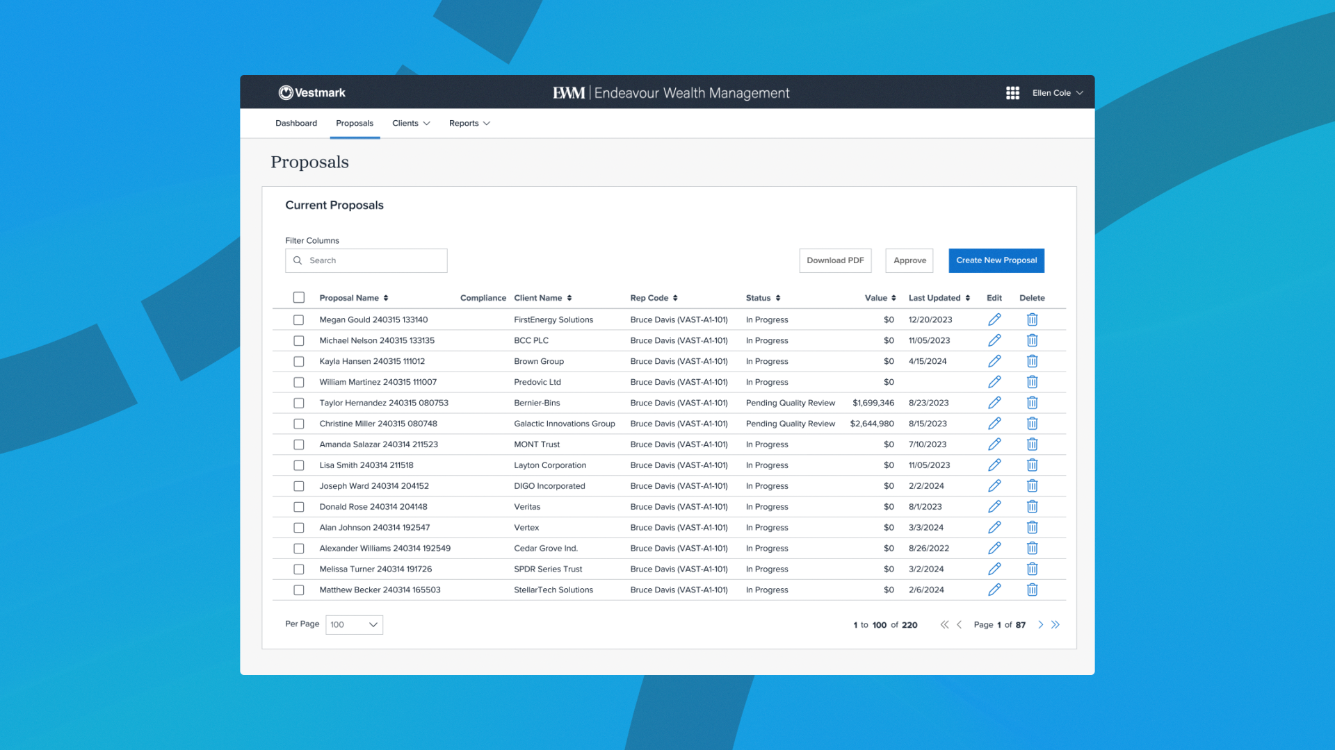
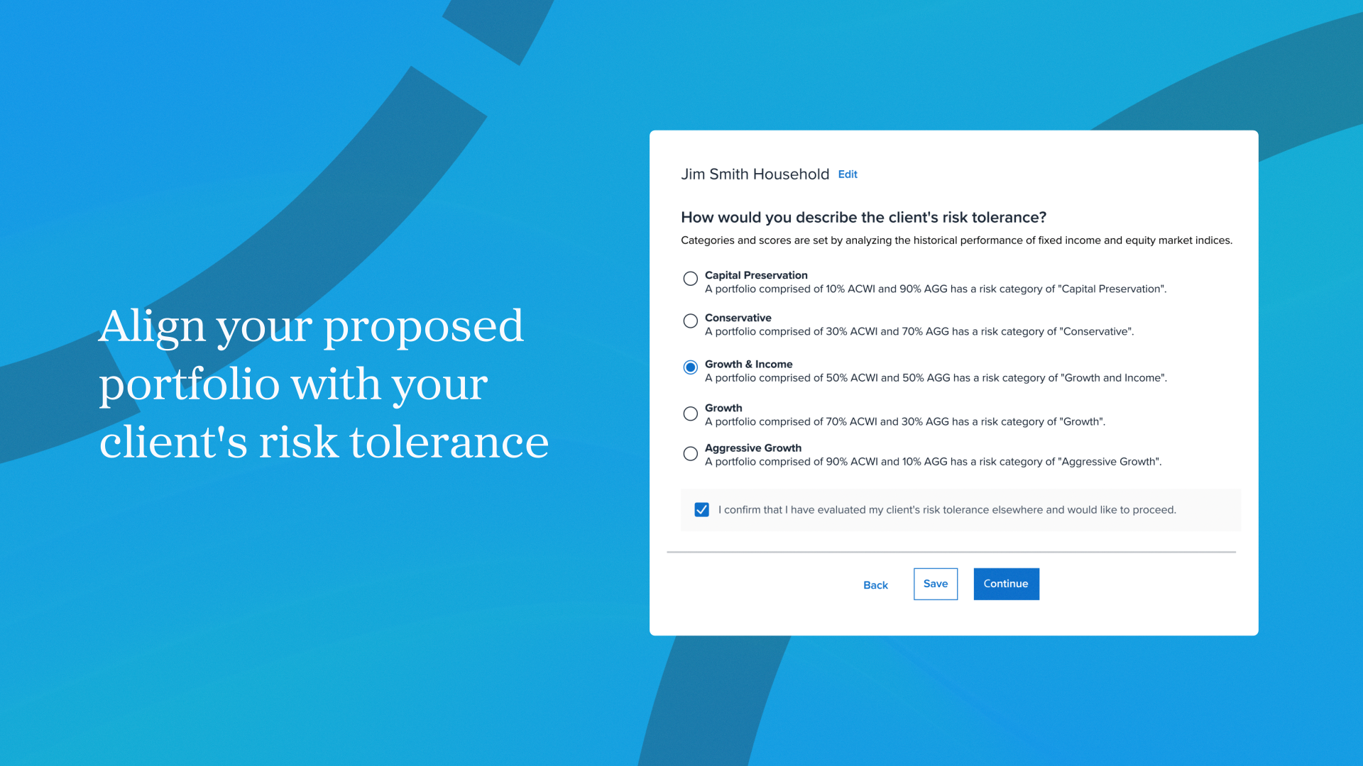
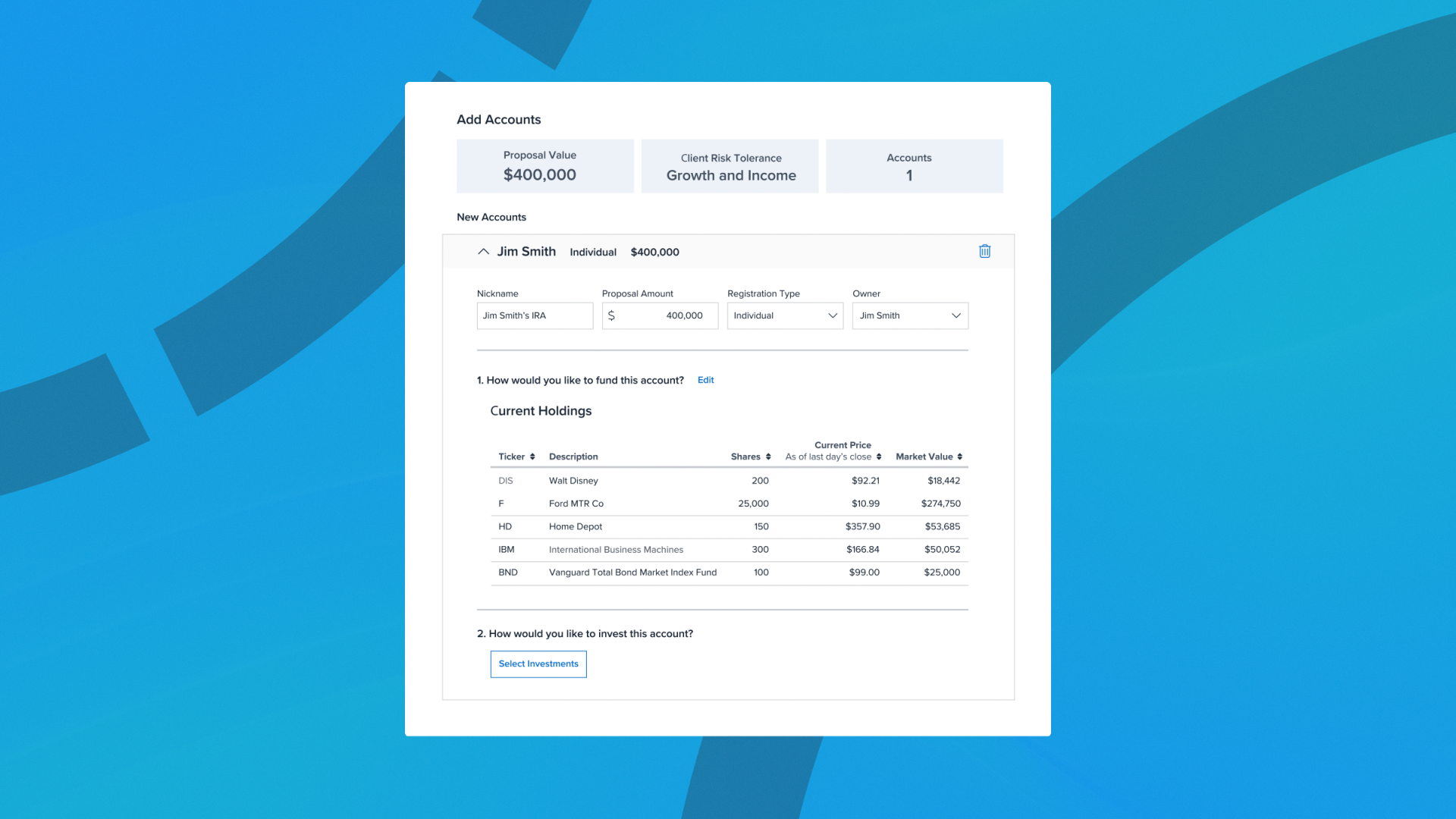
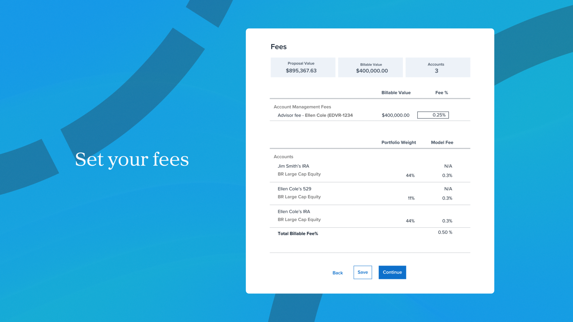
This project focused on refining and presenting Vestmark’s UI through motion in a way that emphasized clarity, usability, and approachability.
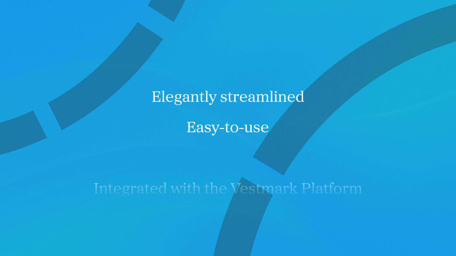
The objective was to communicate the platform’s ease of use while clearly articulating why Vestmark is a strong solution for its audience. The work needed to feel polished and trustworthy while remaining accessible, translating complex interface elements into a clear, engaging visual narrative suitable for homepage placement.
Working within Vestmark’s existing brand system, the UI was adapted for motion to improve hierarchy, pacing, and readability without departing from the established design language.
Challenges & Solutions
Enhancing UI Clarity While Preserving Brand Identity
A primary challenge was refining the UI screens to improve clarity and usability while maintaining alignment with Vestmark’s existing brand and interface design. The goal was to enhance legibility and flow without introducing a visual departure from the original system.
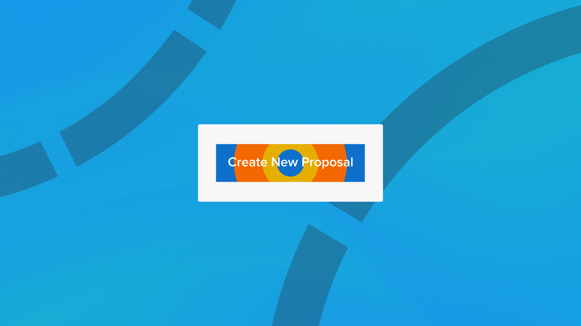
To address this, interface elements were selectively simplified, spacing and hierarchy were adjusted for motion, and transitions were designed to guide attention through key interactions. This allowed the UI to feel more intuitive in motion while remaining brand-consistent.
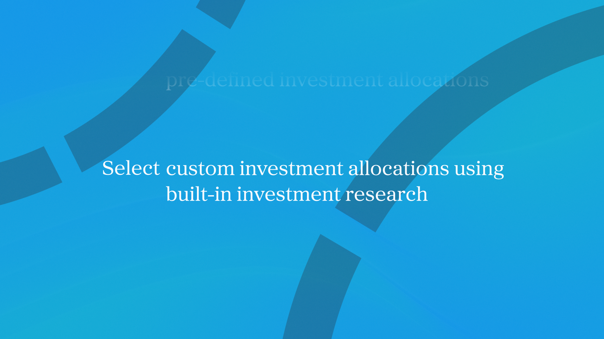
Condensing Messaging for a Homepage Narrative
Another challenge was condensing the script to fit within a one-minute runtime while keeping the messaging clear and impactful. The content needed to be concise enough for homepage viewers while still communicating the platform’s value.
Through multiple iterations, the script was streamlined to focus on essential functionality and benefits, resulting in a smooth, efficient narrative that supports quick comprehension without sacrificing clarity.
Result
The final piece presents Vestmark’s platform through a refined, motion-driven UI narrative tailored for homepage use. By balancing interface clarity, brand consistency, and concise storytelling, the work delivers an engaging overview of the product that supports both awareness and understanding.